Lettermark
The lettermark 'W' is the chief differentiation and underpinning symbol that represents our brand. It should always remain clearly perceived in interaction with typography, image, and layout elements and must never be dominated by other design components.
Download our full lettermark pack with the approved PNG assets.
Lettermark Formats for Download
Lettermark Red PNGLettermark Black PNGLettermark White PNGLettermark White on Black PNGLettermark Logo PackDownload allAppearance
The lettermark can appear in Wetpaint Red, flat black or flat white and must stand out clearly against every approved background. Elements with similar colouring may not be placed behind or on top of the lettermark.

Red on white

White on red
Black on white
White on black
Positioning
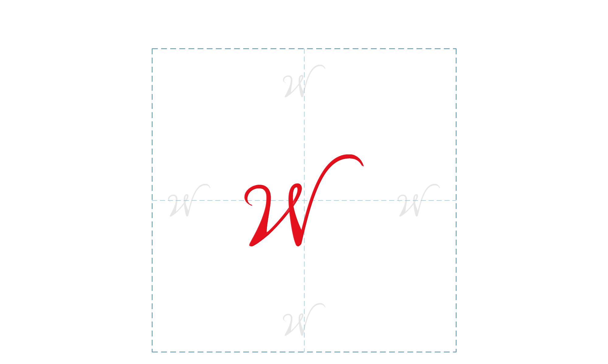
Clear Space
For a consistent and cohesive brand, it is important to use the Wetpaint lettermark correctly at all times. Clear space around the lettermark must be observed. The defined clear space zone may not be invaded by any other element such as type, images or other logos.
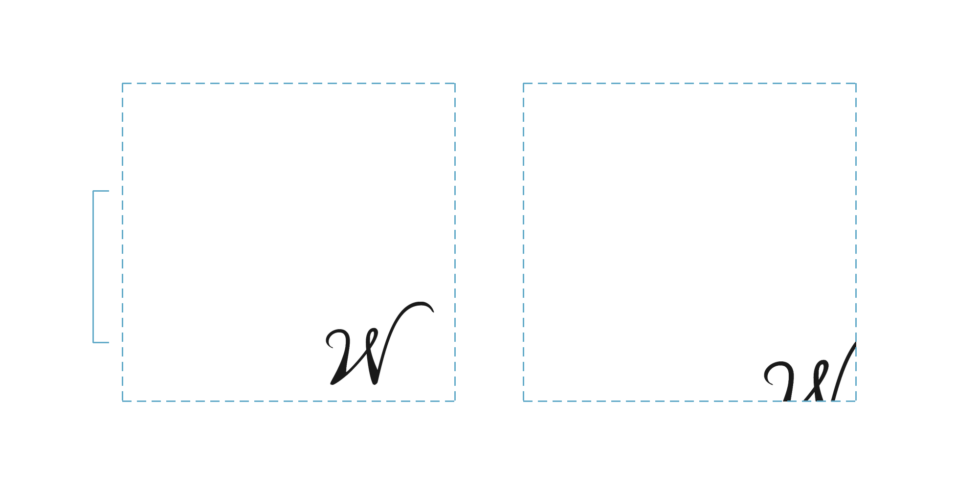
Bottom-right & trimming
The lettermark “W” is to be mainly used at the bottom right-hand side of communication materials. It can overlay spaces or images or be placed over other elements as long as the lettermark integrity is kept intact: perceived clearly and distinctly. The lettermark can be trimmed horizontally from the right-hand side only and/or trimmed vertically from below only.
Important: when trimming the lettermark, it must keep at least 80% of its integrity intact in order to remain distinguishable.